Brothers Grimm & Natalie Frank
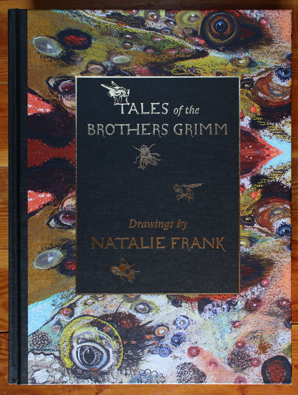
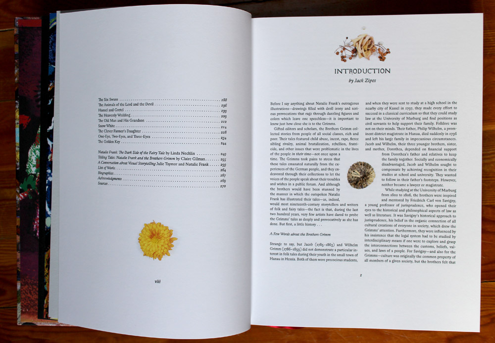
Sometime in early- to mid-2015, I got a message from the artist Natalie Frank, who wanted me to design her book of the original tales of the Brothers Grimm. Natalie had created a series of chalk pastel drawings based on a selection of the stories, and instead of creating a regular catalogue of the work, she wanted to do a book of tales. She had Jack Zipes, the famed translator of the original version, on board for the Introduction, A publisher (Damiani) and a cast of characters for production.
For those who are not familiar with them, the original versions of the Tales, as written by the Brothers Grimm, were not for children, th n or now. They are full of gruesome punishments, incest, murder and otherworldly happenings. They also contain a number of interesting female characters with surprising control over their own fates.
Natalie had seen my book I Wonder and she asked me to design this book as thought it were mine, only the art was hers. I was intrigued by the stories and Natalie’s work, and so we embarked on rather an epic journey together. I’m pleased to say that not only did the book turn out just as I had envisioned it, but Natalie and I became good friends in the process.
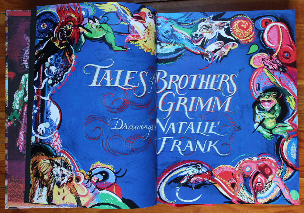
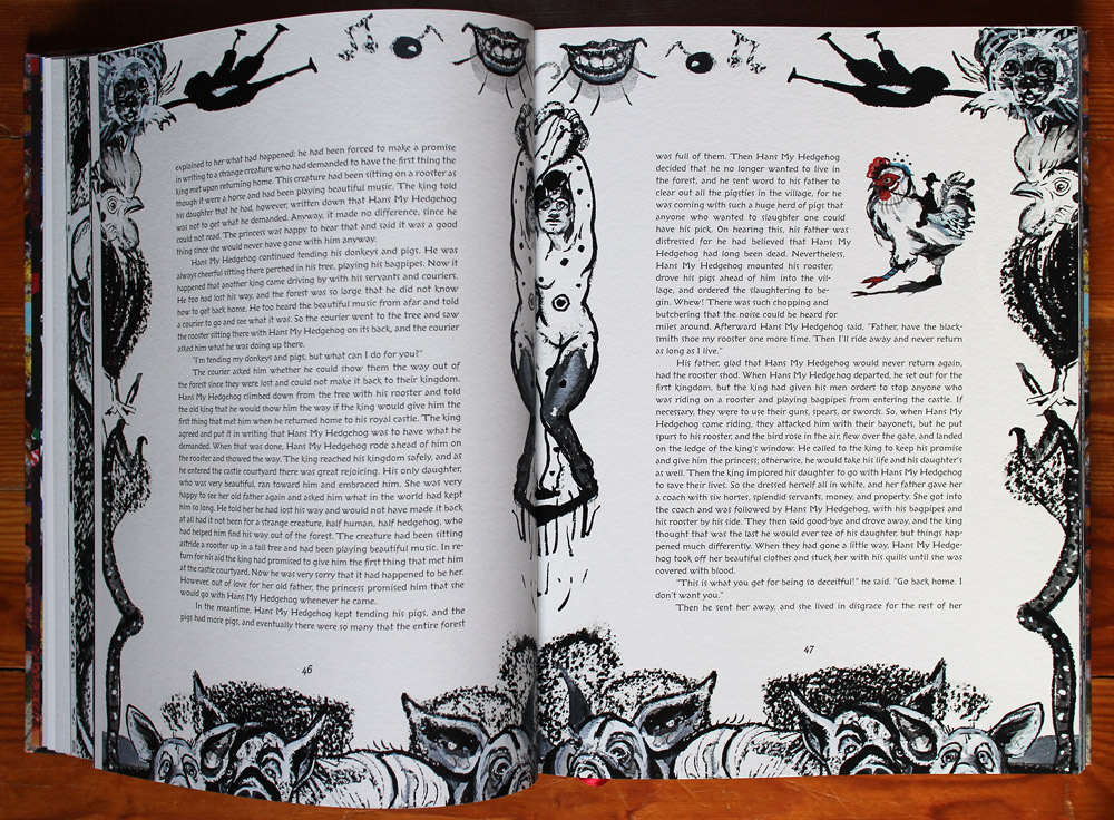
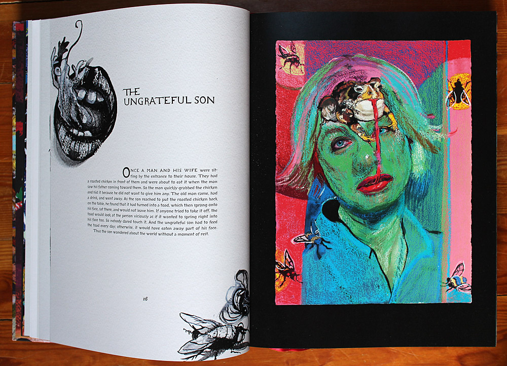
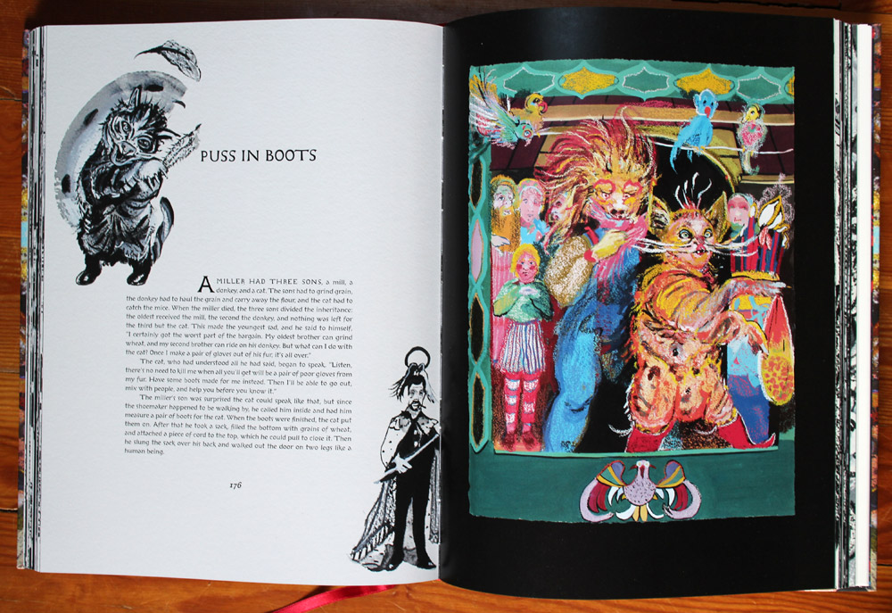
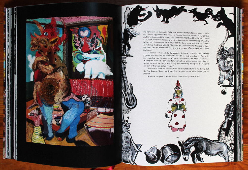
I saw the tales as being dark—they are weird and sometimes nightmarish, and I wanted this feeling to be a visual part of the book. Natalie’s drawings are a juxtaposition of this dark material and very bright colours, so I wanted them to really glow out of the darkness. I devised a layout that worked with borders. On the pages with Natalie’s colour drawings, I used a black background. On the text pages, I asked Natalie to draw borders in black and white for each story.
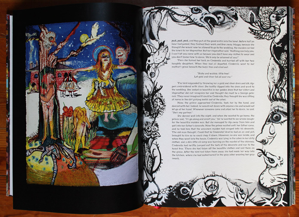
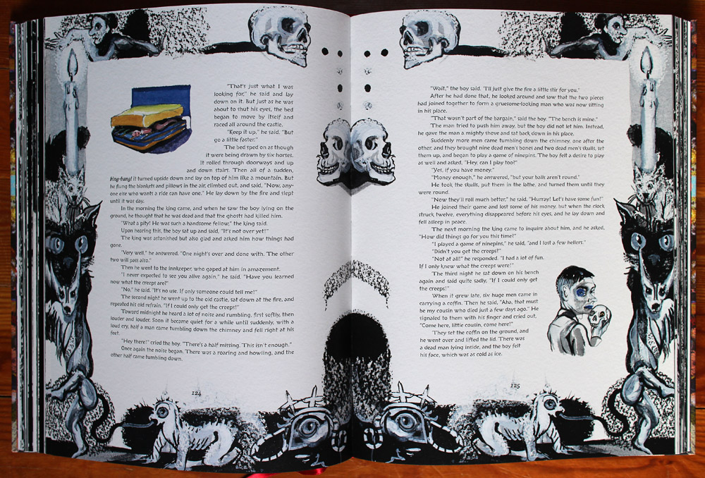
This resulted in a lot of extra drawing for Natalie! I had her draw one border for each story, and on facing pages I flipped it. This made for some interesting intersections of shapes and faces in the gutter.Some of the borders Natalie drew tight to the border edge, like a rectangle, and some of them were more shapely and loose. They are wonderfully varied from story to story.
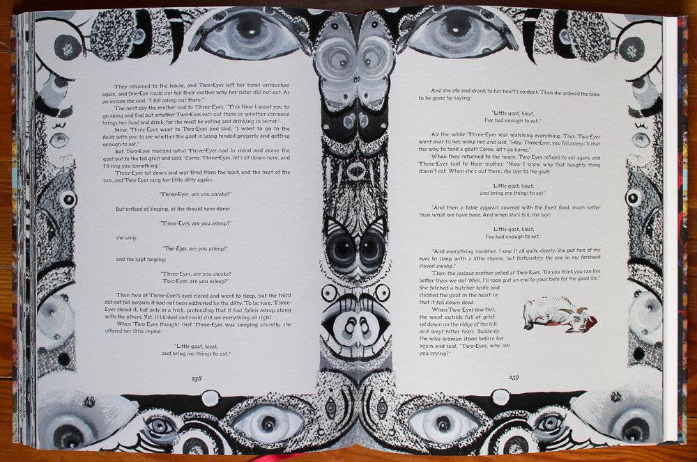
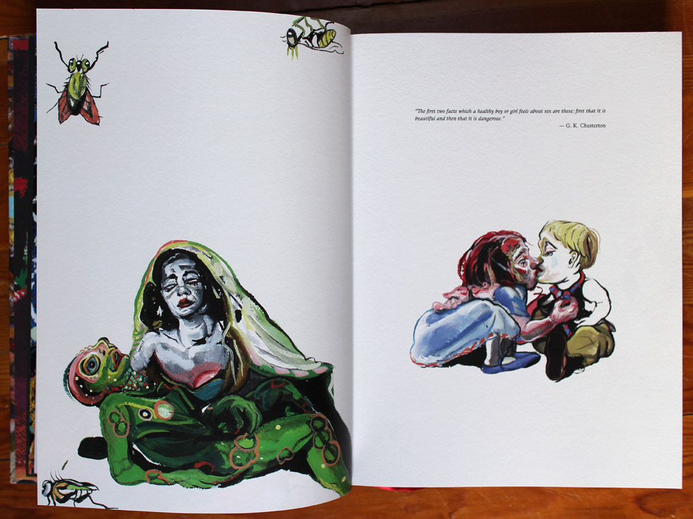
I also didn’t want space at the ends of stories, so as I laid it out, where the text fell short on the last page of the story, I would go through and find places where I could get Natalie to make little illustrations of the text to insert and cause the text to flow to the bottom of the last page. This caused even more drawing for Natalie. But we had a ton of fun with these. All sorts of strange things: dead animals and bones and axes dripping with blood. For some reason both Natalie and I found this hilarious.
The only places with any appreciable white space are the chapter openings. I wanted them to stand out a from the rest of the pages, so there is no border, only a drawing to go beside the title and a drawing in the lower right corner. The book was also designed so that all chapters are followed on the next page by a full page colour drawing.
Because the borders were drawn to-size on art paper, I had a conundrum in terms of how to deal with the paper background. The black and white drawings also include white paint, which is whiter than the paper, and I didn’t want to lose any of it by knocking out the paper background to pure white. So I decided to keep the paper texture for all of the text pages. Natalie’s chapter openers are also drawn on a full page, to-size, so when they were photographed they all had to maintain the same paper tone throughout.
This decision made me a little nervous because I am opposed to faking the texture of an uncoated paper on a coated stock. But in this is case I felt it was more like we were not faking paper, but were printing the text right over the black and white drawings. (The insert images were merged digitally.)
I took a couple of other risks with my typefaces. I have quirky taste in typography, to say the least. While decades ago I was a purist, I am now almost anti-purist. As soon as I read the text, one typeface came to mind, and that was StormType‘s Libcziowes (which, incredibly, no longer exists on his site!). It is one he drew from type he found in a Czech graveyard, and it is very irregular, pointy, twisty and old. But it fucking works. It’s technically a display face and has only the one weight, which caused a few problems, but I tried many other typefaces and kept coming back to Libcziowes.
Perhaps more strangely, it is paired with StormType’s Lexon for the folios, front and backmatter, and the odd bit of “italic”. Now that is really strange, and it makes even me uncomfortable, but again, it matches the character of the book.
Natalie wanted a little bit of me in the book, besides the design, so the front and back matter have some little photographic interruptions made by me, with mixtures of dead things (flowers, seed pods, a bird’s wing, bones) and fur, gems and other bits I have lying around.
For these sections the layout also changes to 2 columns with centred titles, the typeface changes to Lexon, and as there are no more of Natalie’s drawings, the pages are pure white.
Oh, and I did the lettering on the title page, too.
The book size is 9 x 12 and has 272 pages of glorious words and artwork.
You can get it in bookstores or through Amazon.
It’s been receiving a ton of great press, which you can see (and read more about Natalie’s process on the original drawings) on her site.