Design Matters Live
Debbie Millman asked me to design the poster for a four-part Live-in-Person version of her famous internet radio show “Design Matters.” But this was for four live-in-person interviews to take place in San Francisco.
I wanted to create a poster that had to be experienced live, in your hands, to be fully appreciated—like the 4-part series. This led me into the complicated world of translucent paper.
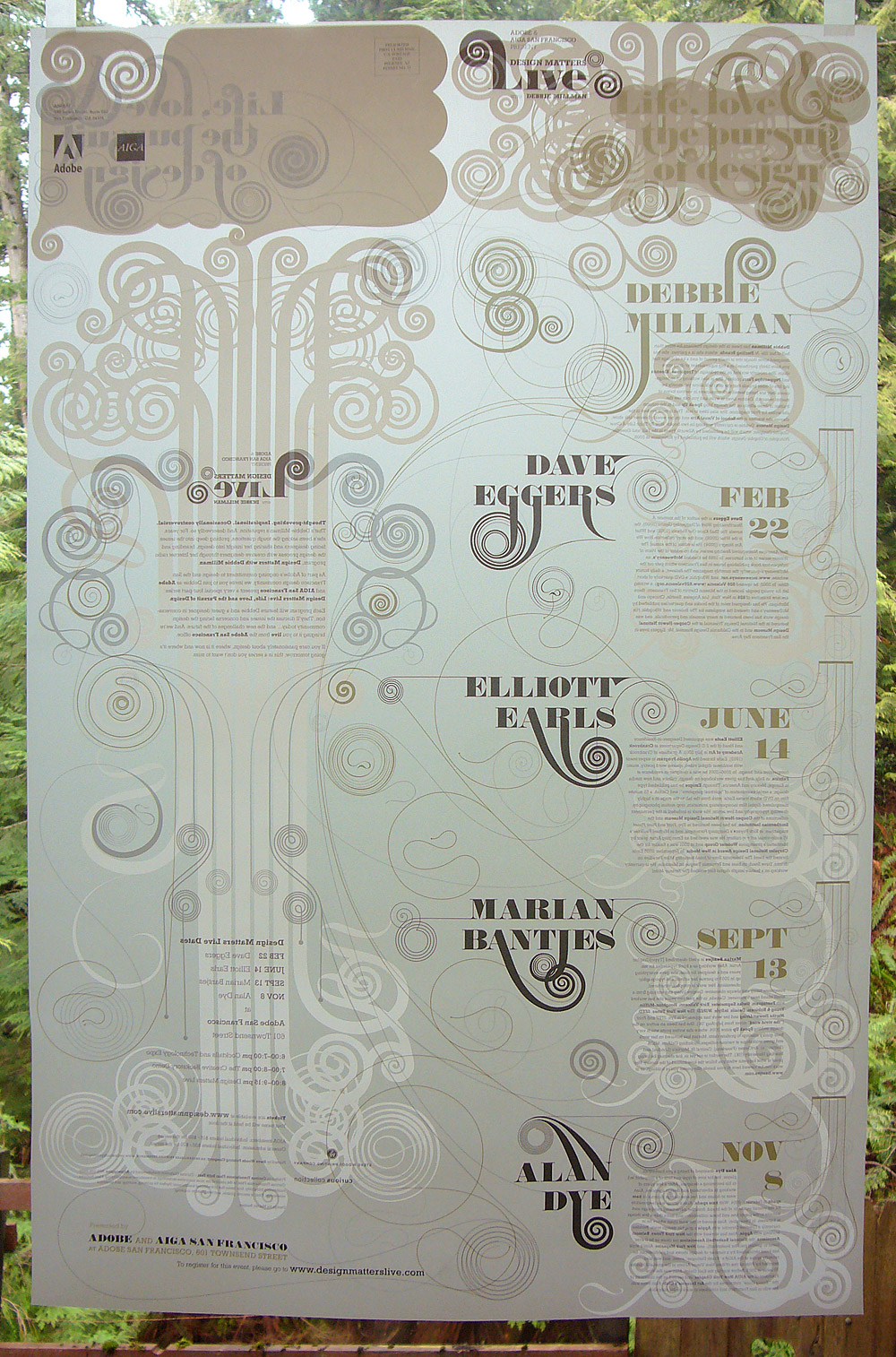
Instead of having the traditional “pretty side” and the “text side”, I wanted to have an interaction (or “conversation”) between the two sides. The poster was carefully designed so that text and imagery appears in reverse on the front (or back), although some areas are partly masked with white ink from one side to the other to avoid confusion and create a difference between the 2 sides.
The white ink also serves to create different effects depending on how you view it. If the poster is viewed against a dark background, the white ink is visible and there is a lot of complexity. But if it is viewed against a white background, the white ink disappears and the text becomes very clear.
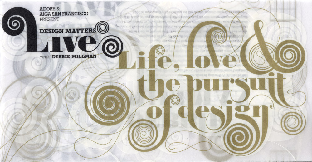
In addition, the poster was designed as a self-mailer, and the layering of lines is both intriguing before it’s opened, and undergoing constant change as you open it. As I intended, the internet doesn’t do it justice.