PRINT: Regional Design
Each year, Print Magazine publishes the winners of their Regional Design Awards. I was asked to create the cover, a title page and 6 separate opening pages for each region.
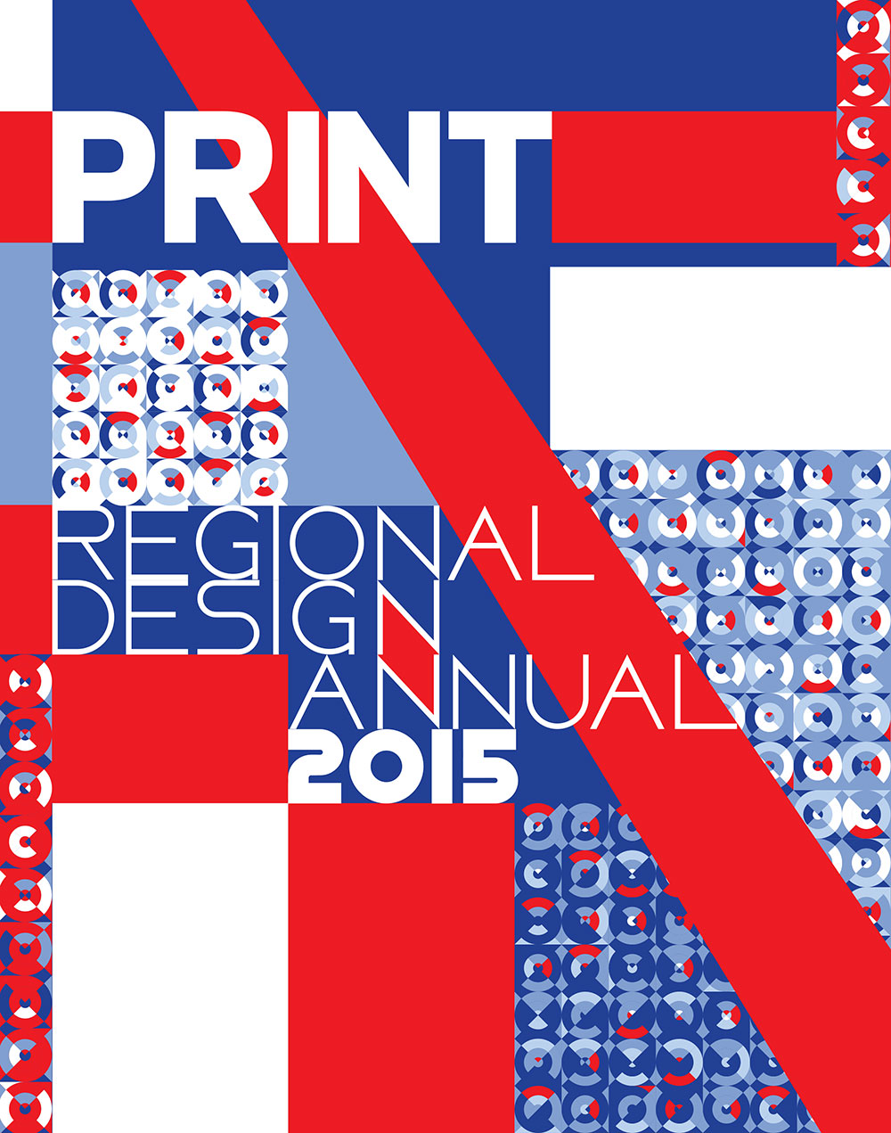
The cover is built off the structure of the PRINT logo. The title and the regional pages are built off a grid based around the typography (mine) and a positioned “target” for each region.
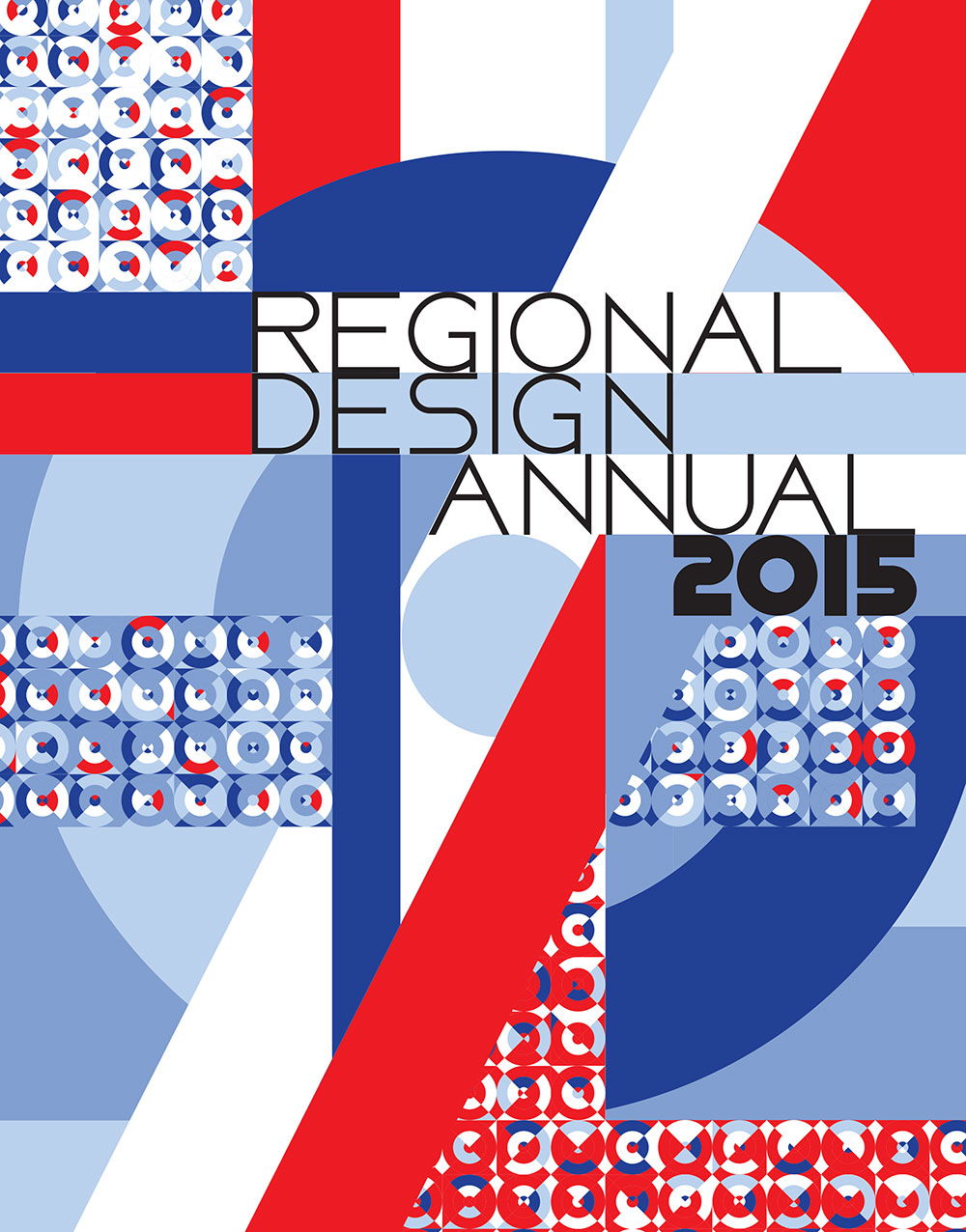
The colors are based on my own idea of the colors of the regions.
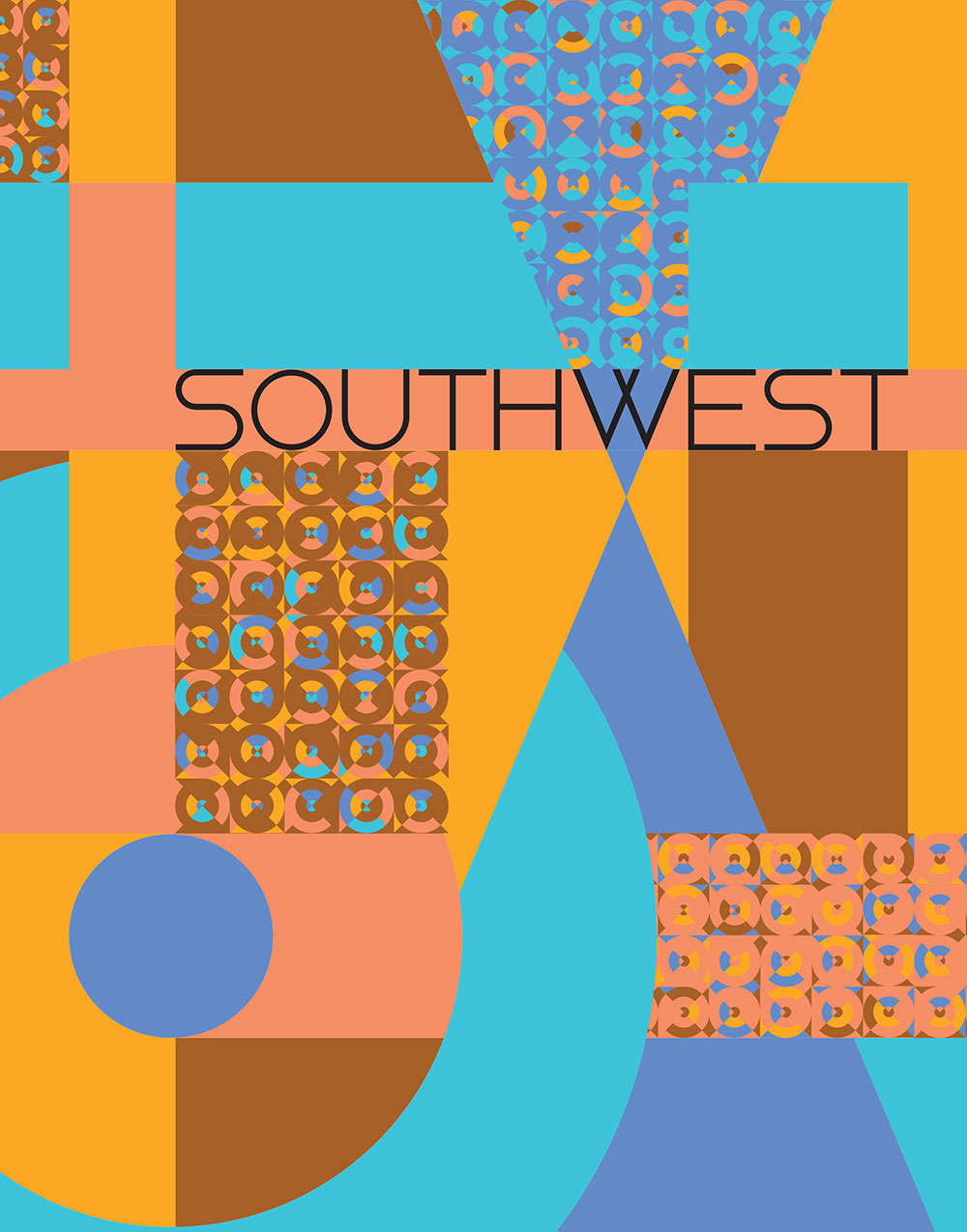
The Southwest is based on brown and yellow and pinkish earth colors, with a medium sky blue and turquoise.
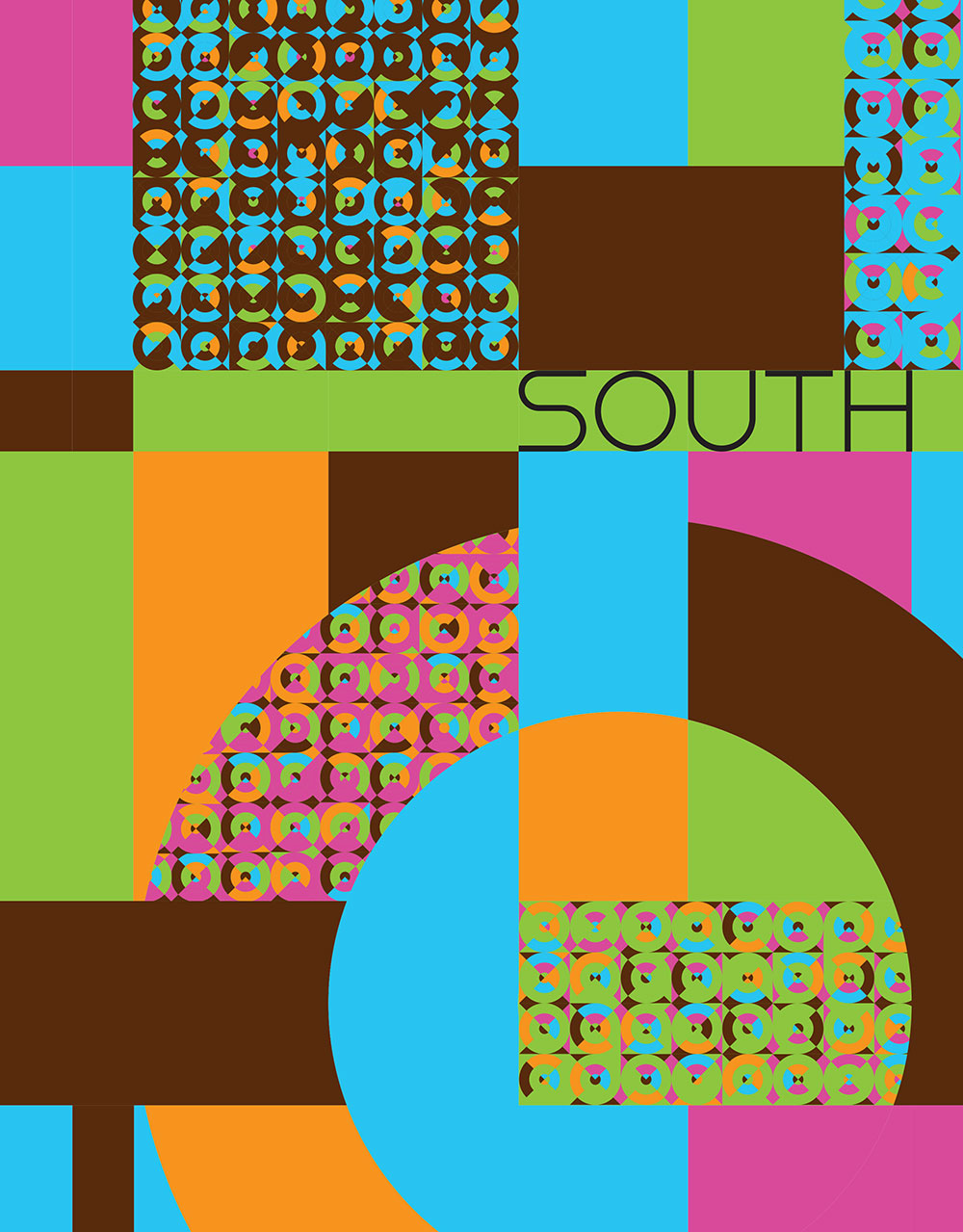
Orange(s) and bright green, tropical flower pink and ocean turquoise with mud brown for the South.
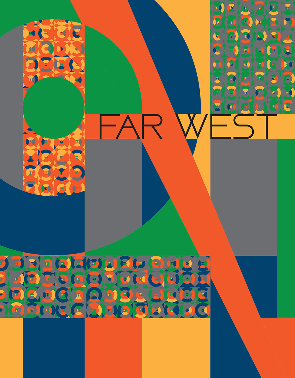
More orange(s), dark blue ocean, sandy yellow, concrete grey and tree green for the Far West, in an attempt to cover California up the coast to Seattle.
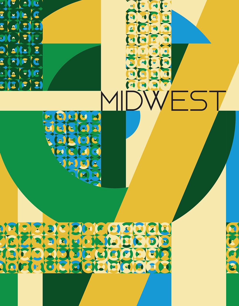 I used wheat yellow and corn yellow, tree and field greens and bright sky blue for the Midwest.
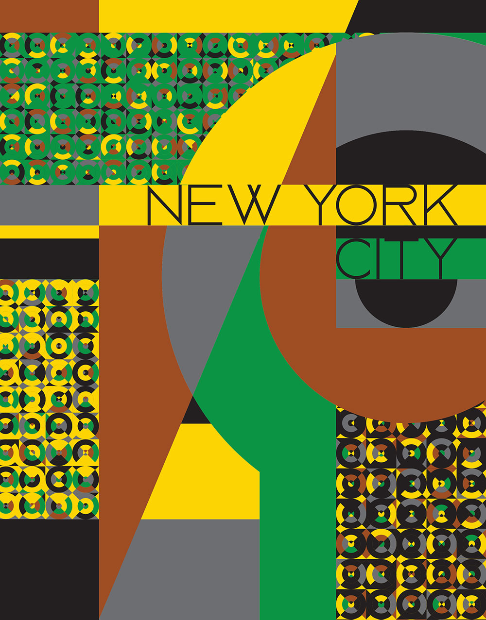
Black (of course) and concrete grey with brick brown, tree green and taxi yellow for New York City.
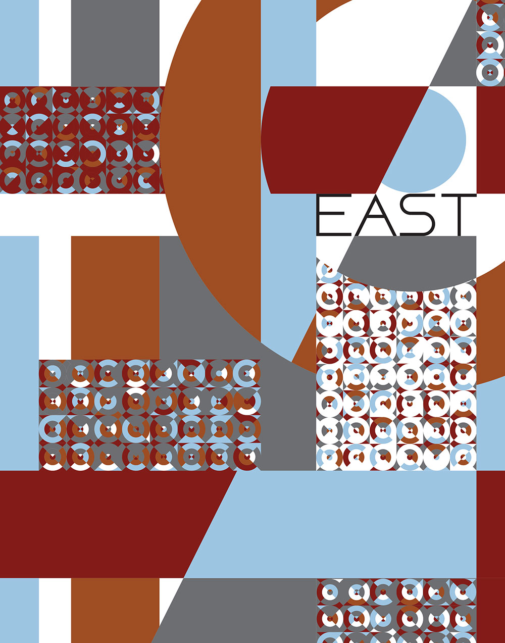
And snowy white, with cold sky blue, concrete grey, brick brown and a dark red (for some reason) for the East.
Here’s a short interview with Print magazine about the work:
http://www.printmag.com/featured-design-inspiration/marian-bantjes-on-her-2015-rda-design/
2015