I Wonder
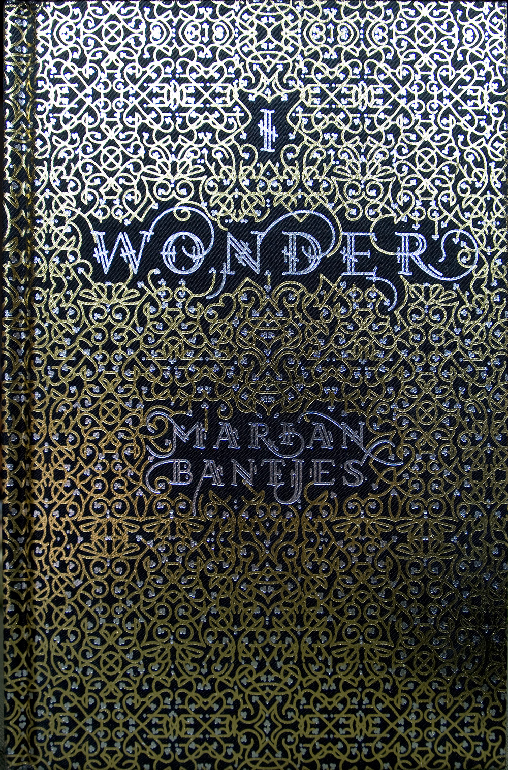
I Wonder by Marian Bantjes
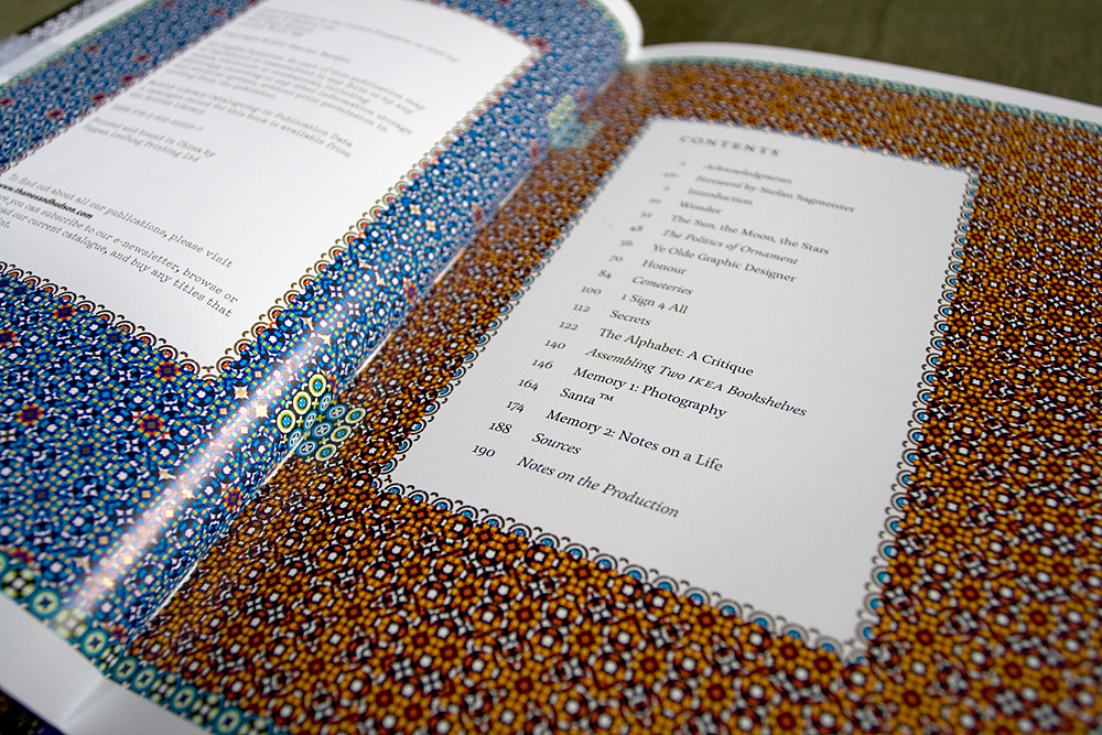
208 pages
Hard cover
15.5 cm × 24cm (approx. 6 × 9½ inches)
Printed in full colour plus gold throughout.
List price: £19.95 / $40
Release date: October, 2010
Published in the UK by Thames & Hudson, ISBN 978-0-500-51529-7
Published in the USA by The Monacelli Press, ISBN 978-1580932967
I Wonder on bookdepository.com
This book is my masterpiece. I spent 15 months between 2009–2010 writing, illustrating and designing it. It’s a gorgeous hardcover, with gold and silver foils on a satin cloth, with gilded page edges. It’s printed in 5 colours throughout (mostly CMYK + Gold) on a coated stock. At a smallish size, it is a book meant for holding and reading, curled up in your favourite chair.
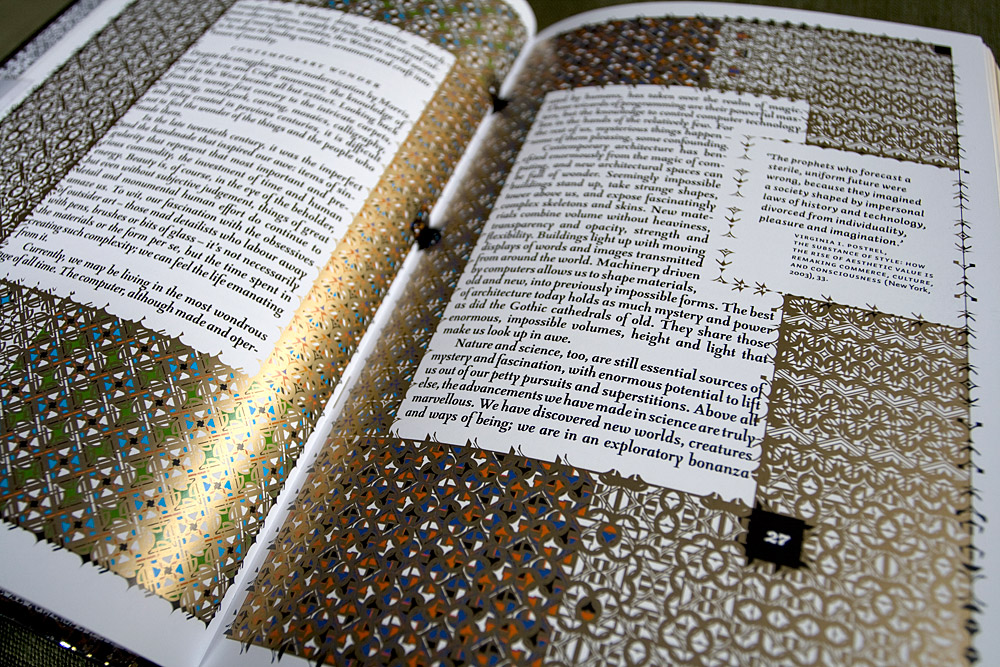
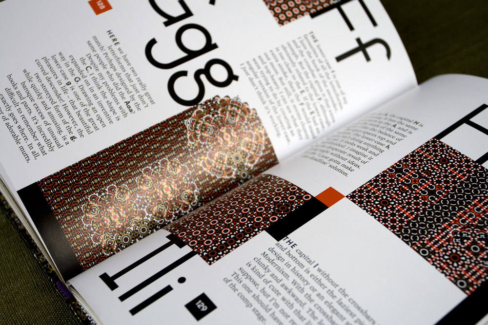
Every single illustration is new, created for the book, and the content is not about my work (i.e. not a monograph), but instead combines graphic art with the written word, and lends my own contemplative but frequently amused voice to my observations of the world.
Some of the articles were originally published as blog posts for the now-archived blog Speak Up, but they have been resurrected, edited, rewritten and given new life in these pages. Those quirkier writings are interspersed between more philosophical musings on the nature of Wonder and Honour and Memory as they pertain to graphics and the visual world around us.
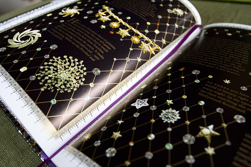
As a book experience, the relationship between the content and the graphics is very important. They are totally interdependent and neither the articles nor the graphics can live without the other.
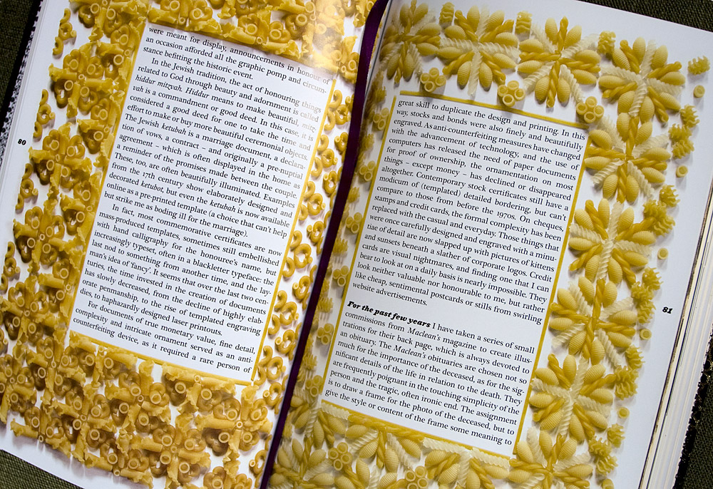
The book is in many ways eclectic, with a variety of forms and moods, represented in an abundance of typefaces and graphic styles. But, much in the way of one of my favourite films, the documentary “Fast, Cheap and Out of Control” by Errol Morris, this disparity picks up threads one from another as it progresses, and starts to weave together in a unified whole.
Ultimately the range of thoughts, personal history and hare-brained ideas come together. To the eyes, it is a feast for visual gluttons, but as those who are familiar with my work will already know, there is food for the mind and the heart as well.
While the book will be enjoyed by designers and our ilk, it also has a broad range of appeal. The thoughts and experiences within are largely universal, and at times very personal. Buy one for your mother! Your nephew! Your boyfriend!
Reviews
“I Wonder is not a monograph but, in Bantjes’ words, ‘a book of ideas’, a generous collection of essays lovingly typeset, illustrated, laid out and produced in a manner that resists a quick glance, a skim read or any easy generalisation or summary. This is ‘slow print’, in which Bantjes’ mind-bogglingly detailed type and lettering forces the reader to spend time with this elaborate yet welcoming book. […] I Wonder is undeniably obsessively stylish but its contents are by turn informed, witty and, in the case of the chapters about ‘Memory’, movingly personal.“
— John Walters, “Slow Print”, Eye #77
“…I am compelled to write about “I Wonder” with as much flourish as is graphically demonstrated on page after page; I find the book that engaging. […] Bantjes’s deceptively compact trove of visual riches, whose floriated cover design is printed in gold and silver metallic inks, with gilt-edged pages that suggest a venerable religious document, is packed with as many stylistic variations as are possible by one author/artist/designer in 192 pages. And it is a wondrous, if breathless, display of virtuosic craft. […] not a typographic jewel or fleuron or dingbat (as printer’s decorations are called), not a scratch or scribble or scrawl (as some of the typographic techniques should be called) is out of place.”
— Steven Heller, “Graphic Content | Marian Bantjes, Illuminated”, New York Times Magazine
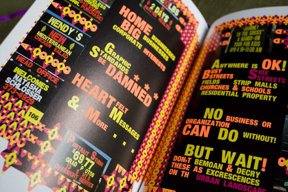
” ‘I Wonder’ is more than just eye candy. It is worth taking the time to explore Bantjes’ theoretically founded design approach: The illustrations not only serve as decorative frames, but deliver important information which is tightly interwoven with the texts. For example, the photographic series of everyday, bland signposts in the author’s hometown first reveals the idiosyncratic typographic appeal of everyday graphics. Not until these elements are agglomerated do the larger patterns in her work take form. […] ‘I Wonder’ is a playground for Marian Bantjes’ non-conformist emotional approach to design. This stance, which draws its vitality from a childish curiousity makes it a marvelous antithesis to increasingly strategic and calculated communication design.”
—Wiebke Lang, “Bantjes wundert sich / A Book of Many Wonders”, Form Magazine (Germany)
“I Wonder rises above the usual design book in the way Bantjes marries her text — a deeply considered set of essays on topics such as Wonder, Ornament, Honor, the Alphabet — with the shapes and patterns her imagination enters to reveal layers of meaning. Again, those of us familiar with her art will not be surprised at how she uses everyday elements to capture profound thoughts. In Bantjes’ world, there is really no boundary between text and ornament, message and medium, everyday and profound. What I found most rewarding about I Wonder, though, is that instead of merely impressing or (worse) intimidating, the book is a testament to the artist/author’s belief in the ultimate democracy of the act of creation.”
—Tom Biederbeck, Felt and Wire
“I Wonder never, ever stops to let your eyeballs rest. It just keeps coming at you with page after dense page of visual stimulus. It’s like a mix tape that never, ever ends of the best of Metallica, Guns N Roses, Led Zeppelin, Spinal Tap (yes, that Spinal Tap), and perhaps some Pink Floyd while another tape plays classical music on your other ear. In other words, it rocks.”
—Armin Vit, Quipsologies
“… this book, with its carefully crafted pages has the aura of a precious, if not divine object. Reading and looking at its cornucopia of visual expression, on subjects ranging from IKEA to gravestones, to Santa, makes you feel that held within here there is some hidden code, some secret path to creativity. And at the heart of all this is Bantjes’ ability to deliver all this with levity.”
—John O’Reilly, Varoom! magazine (UK), #13, Summer 2010, pages 62–63
“… we’re also taken with Bantjes’s sentences, and with her knack for conveying just why it is that certain images cut us to the quick, or kick our imaginations into a higher gear. This eye-catching book is chock-full of brain candy.”
—Very Short List
“I was struck that while making notes that my first four bullet points had the word feel in it. It’s appropriate in so many ways. Before opening it I felt I needed to wash my hands. I sort of wish that it had a special box to contain it. Turning the pages was an activity in joy. I loved the weight and the embossing of the front and back covers.”
—Michael Surtees, Design Notes
“More than anything I’ve seen recently this book is a tactile experience, and yet another volume(that designation which Borges always used to emphasise) which makes a nonsense of the idea of screens as an adequate replacement for all books.”
—John Coulthard, feuilleton
“With the book’s insistence on narrative, and focus on typography, the result combines the best of two worlds. It’s a readable collection of smart, visually-intense short stories, and a design book that will likely never leave your coffee table.”
—Alissa Walker, FastCoDesign